Ollech & Wajs
-
Unearthing a logo’s history
-
2024
>
-
Unearthing a logo’s history
-
2024
>







---
Excavating a
historic brandmark
---
This is a key chapter in a much larger book project I worked on for agency Somewhere Up North; for cult Swiss watch company Ollech & Wajs.
To quote a www.medium.com article:
“
Ollech & Wajs wanted to celebrate its iconoclastic and enduring mark by cataloguing each version of it since its inception. The problem was, the original artworks had been lost over time or simply thrown away. The only record of the many tweaks, modifications an alterations to the logo, were on the watches themselves, many of which had faded with age.”
-
I can only describe this as design archaeology... even paleontology.
I was brought on after someone else left this project early on, working with Design Director Andy Lockley, of agency Somewhere Up North - designing a hundred page book documenting the history of the Ollech & Wajs (OW) brand, and its cult watches. A first for the company and an important one.
This brand mark history is a key moment in the book; the first time OW have a document revealing the history of their brand mark over time.
It was quite the design challenge to overcome, not just to redraw, but consider the endless possible permutations, avoid design rabbit holes, yet remain focused, restrained and decisive.
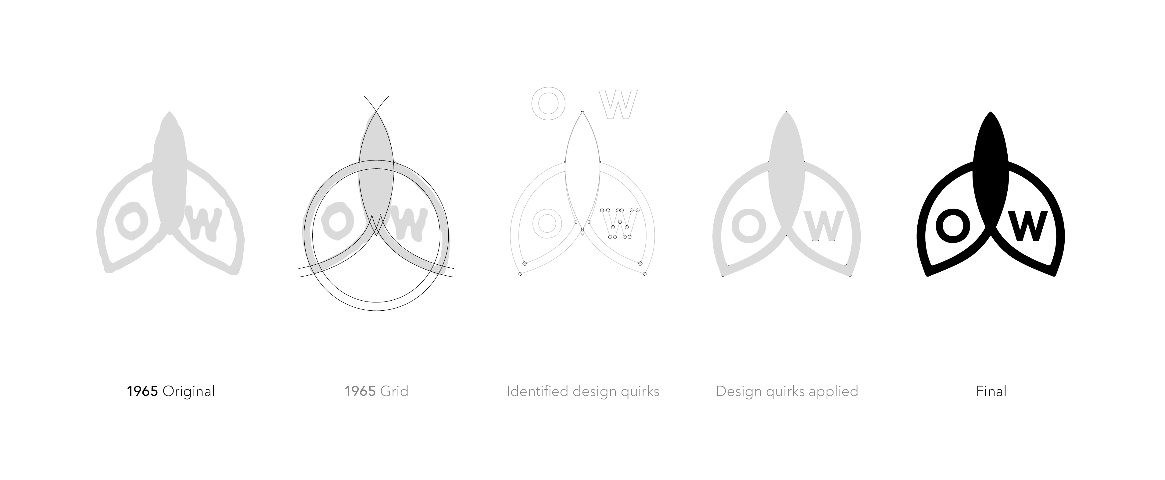
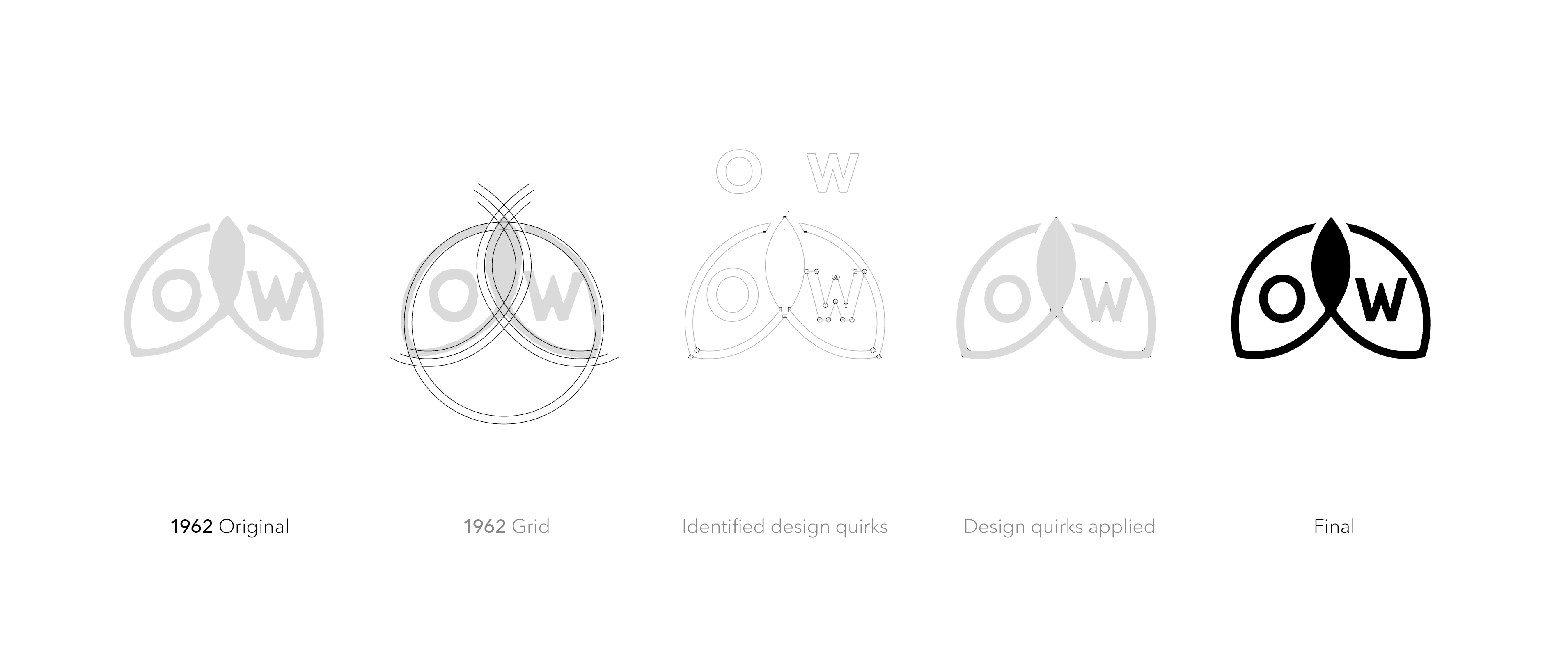
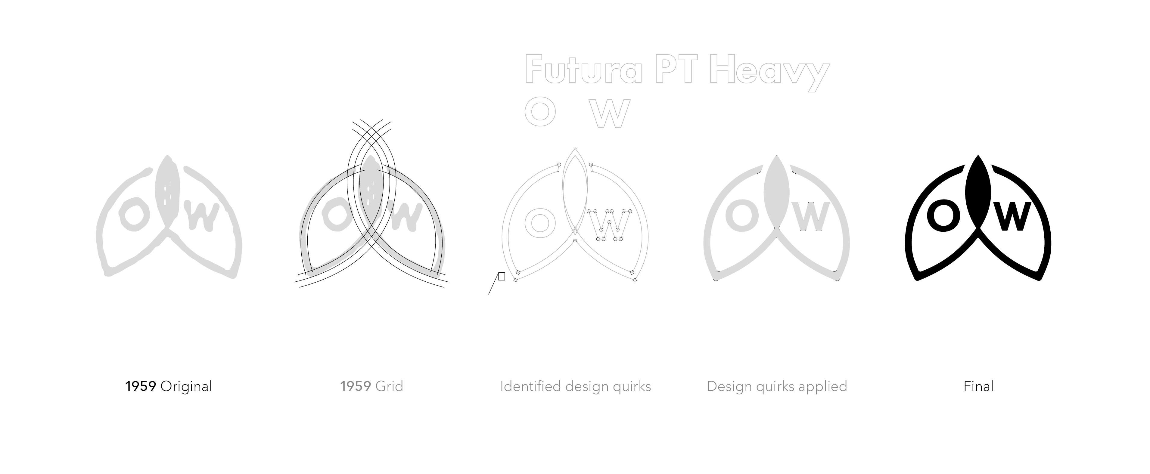
Their original logo reference material as mentioned earlier, was somewhat hazy. In many cases the only references were painted on watch faces. Nuances and details needed to be defined.
Time and money where somewhat limited and just ‘retracing’ was not enough for the aims of this brief, we were to unearth a lost family design lineage.
I redrew the ‘Early Bird’ font also.
To consider:
The originals were mostly likely drawn / painted by hand and how do these logos actually relate to one another even, being that each original source logo is so varied? Literally redrawn every year at one stage.
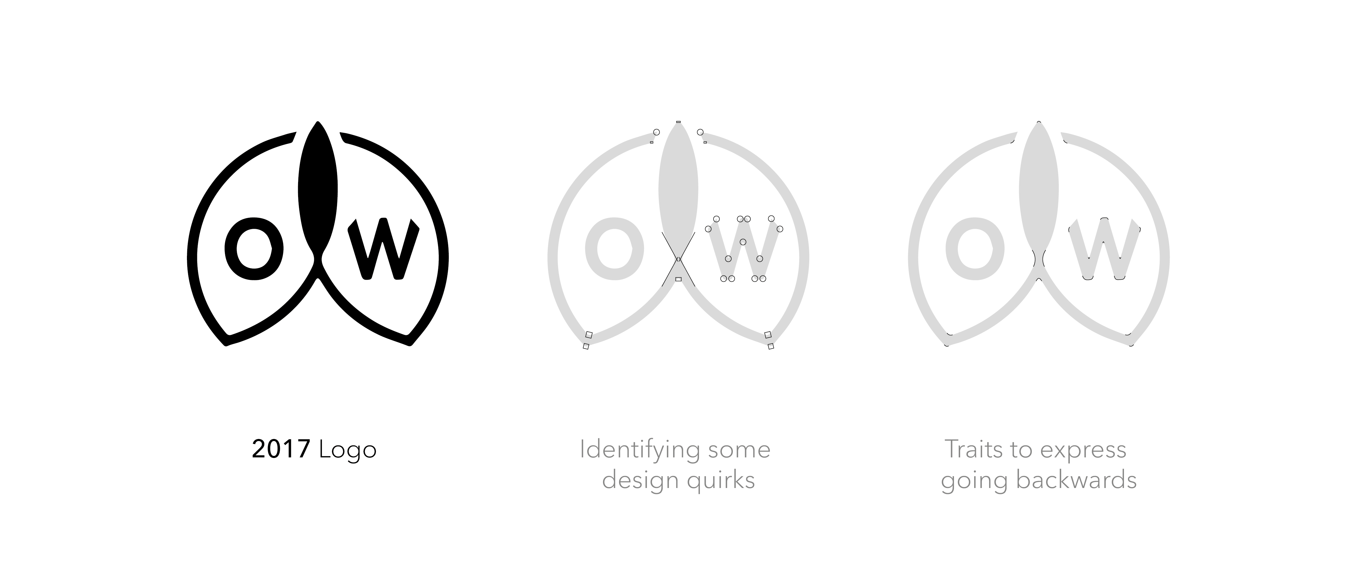
After some trial and error, it quickly made logical sense to identify some key design features (quirks) from the present and express them in each logo very subtly, going back in time, re-establishing a visual coherence.
We kept referring to the idea of David Attenborough finding dinosaur bones and then reimagining how this dinosaur looked, lived and breathed, based on what we already know from birds and other fossils.
Think family resemblances; everyone is different but there are underlying family traits that make you who you are.
For further info click the links below.
---
WEBLinks
-
medium.com
ow-watch.com
>
-
medium.com
ow-watch.com
>